60% reduction
in critical accessibility defects → WCAG 2.1 compliance achieved.
in critical accessibility defects → WCAG 2.1 compliance achieved.
employees using redesigned experience daily.
Improved user confidence: employees reported flows as "intuitive, clear, and compliant."
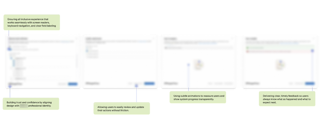
Ensure all employees, regardless of ability, can complete verification tasks.
Simplify flows so that information is organised, and errors are reduced.
Ensure adherence to
WCAG 2.1 and enterprise
standards.
Reduce risk, and turn checks from a burden into a seamless part of daily workflows.
All screens are either recreated or blurred to comply with NDA. Sensitive information has been anonymized, and the visuals are intended solely to illustrate design thinking and evolution.
Across critical WCAG checkpoints — measurable improvements post-redesign
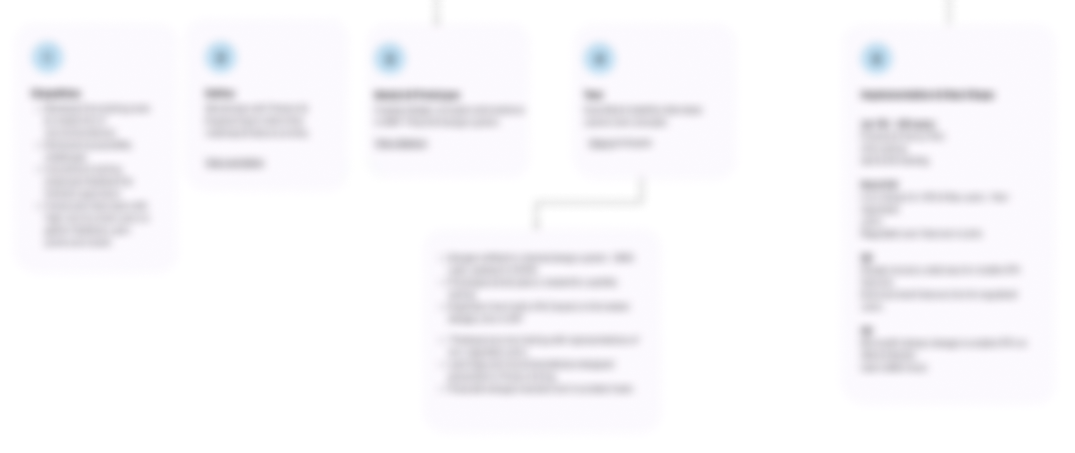
Raw content was being read out (e.g., domains and email addresses not parsed correctly). ARIA labels missing in some dialogs → users lose context while navigating with screen readers.
Dialog labels fixed, domains/emails read correctly, ARIA roles standardized
Dialog and toggle elements not fully operable via arrow, tab, or space keys. Users relying on keyboards face blockers when expanding/collapsing sections or navigating static data.
Arrow / Tab / Space navigation enabled, toggles fully operable
Form fields and mandatory inputs not consistently announced. Semantic hierarchy missing in some sequences → screen readers don't convey structure properly.
Mandatory fields + semantic hierarchy standardized
Inconsistent application of accessibility standards across components creates barriers, lowers trust, and causes rework. Standardizing patterns needed for reliable assistive tech behavior.
Standardized patterns across dialogs, reduced rework & barriers
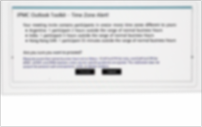
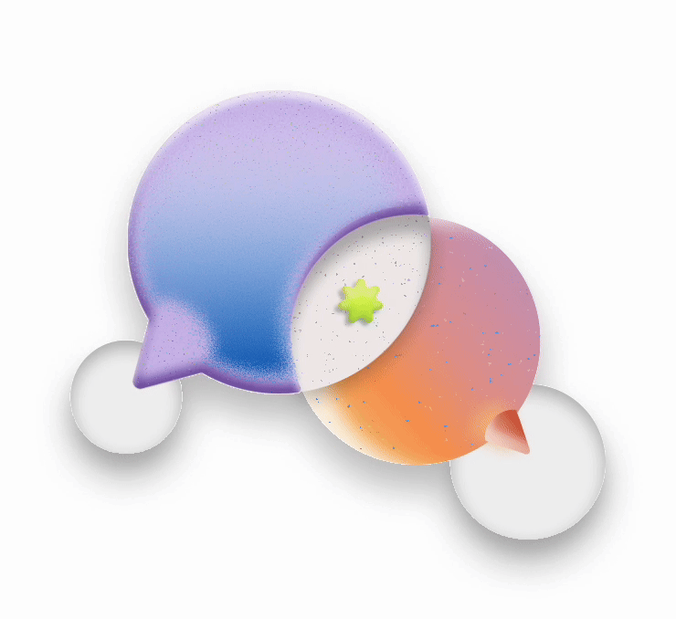
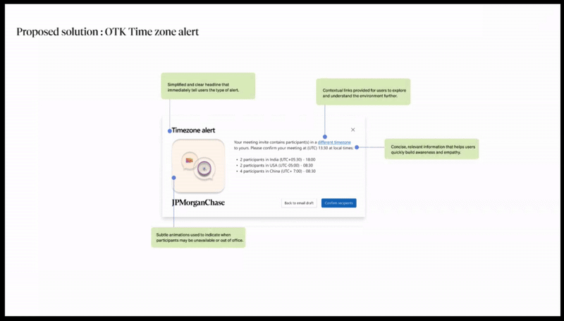
Amongst all requirements, one seemed like a simple re-design of a pop up, but to me it was an opportunity to bring in delight for the users. Since I was designing for native application of Microsoft, using the Fluent 2 3D illustration style to recreate the look and feel.
All screens are either recreated or blurred to comply with NDA. Sensitive information has been anonymized, and the visuals are intended solely to illustrate design thinking and evolution.